About Us
 Products
 Warranty
 User Tools
 News
News
 Blogs
Blogs
 Colors
 Ideas
Ideas Products
 Resources
 Highlights
 blog
blog
Tips & Tricks
Select the right color for your space
Tip 1
Try the paint samples at your home
Colors you select in the stores don’t look the same under the lighting conditions in your house. Before you commit to a color, make sure you take the samples at your home to visualize it better.
Tip 2
Never examine a paint color against a white background
The color is usually affected by what surrounds it so testing it against a plain white wall would just make your color seem much darker than it really is. Instead of sampling it against a white wall, try sampling it against your furniture or flooring for a better perspective.
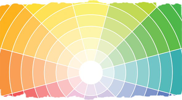
Tip 3
Use the Color Wheel
Trying to figure out what color combinations to choose for your living room? The color wheel is constructed to help you see the relationships between different hues and understand how to best mix and match a cool color with a warm one, for a naturally balanced room.
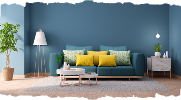
Tip 4
Use the Rule of 60-30-10
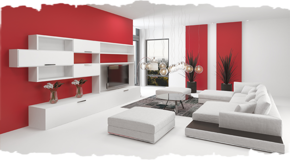
The 60-30-10 rule states that for a balanced color scheme and an appealing look, you should choose a three-color palette for decorating a room, and use it as follows:, use 60% dominant color (walls), 30% secondary color (furniture, textiles) & 10% accent color (accessories) for a perfect combination.
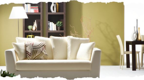
Tip 5
Consider the existing furniture
Carefully consider your furniture, flooring and artworks as the starting point to help you envision your perfect color. It won't just compliment your upholstery but it'll also help you put that rug that you really like into good use.
Tip 6
Consider Room Size
Interestingly, picking certain colors can give a room the appearance of being much larger or smaller than it is, which can help add to the comfort levels. To give an illusion of a larger space, go with neutral colors that can give the space an airy vibe!
Tip 7
Always consider how the color flows from one room to the other
If you have houses with a modern build and an open floor plan, it's essential for you to use one color throughout the main floor. Only add the accent colors after you've carefully considered the areas.
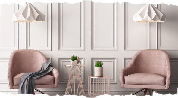
Tip 8
Add an Accent Color
When you want to add some color or dimension to your home interior or highlight your favorite artwork, painting accent walls can be an easy and effective way to do the job! When choosing an accent wall shade make sure you carefully observe the current color of the other 3 walls in your room, and choose a neutral or bold color accordingly.